

Say hello, new logo!
Published on 4 min read
You’ve probably noticed something different this week. ClickView has a new logo! 👀
Same platform, same team, same everything that matters. We just look a little different now. Here’s why.
(And while we were at it, we cleaned up the navigation too. More on that below.)
What’s changing (and what isn’t)
What’s changing
- The logo: You’ll see it in the top-left of ClickView, in our emails, and on socials (basically anywhere we show up).
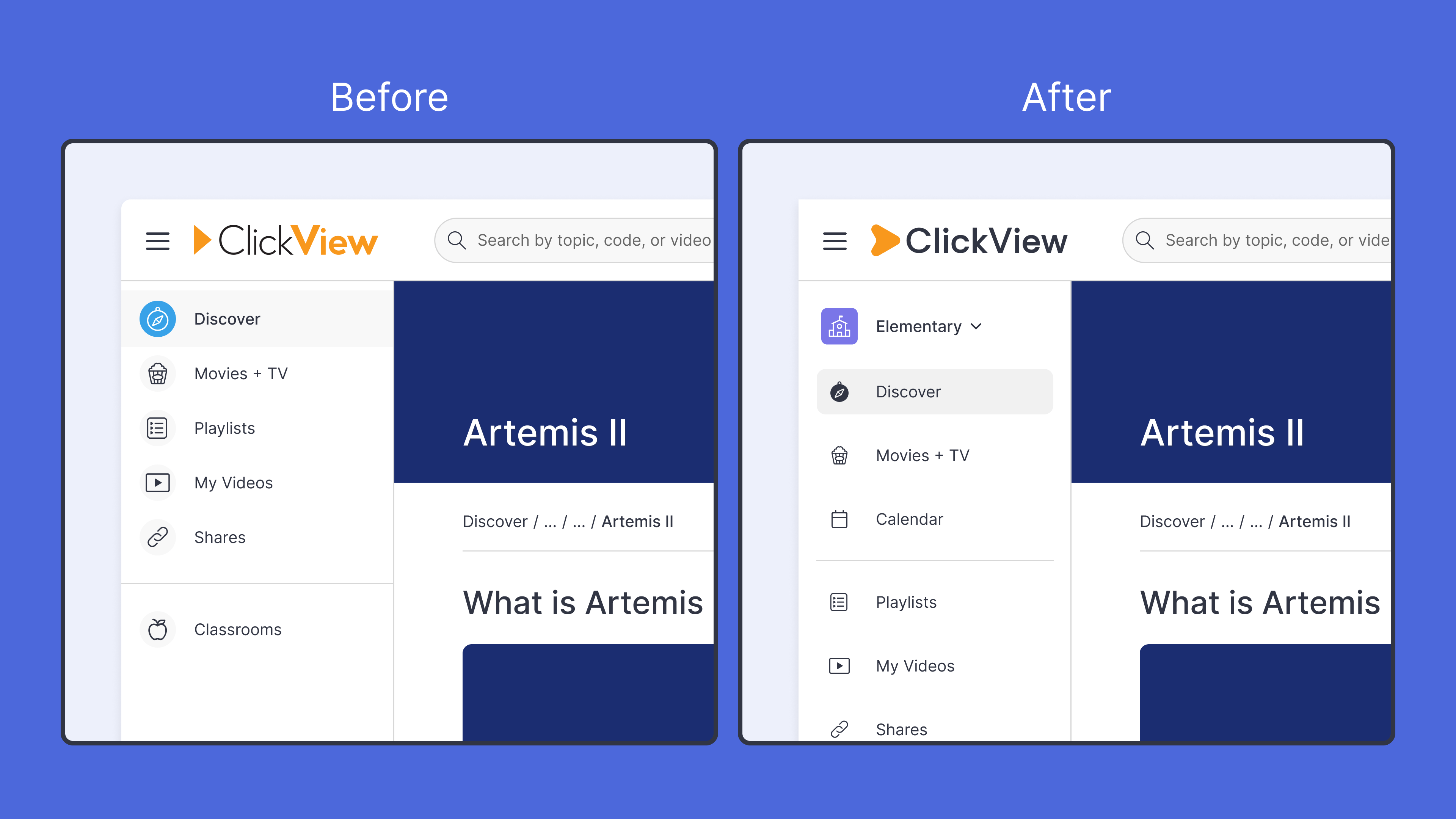
- The left-hand navigation: We’ve updated the icons to a cleaner, simpler style and tidied up the layout. Same pages, same structure – just easier on the eyes.
- Over time, downloadable resources and worksheets will catch up, too.
What isn’t changing
- Your login, library, playlists, and student progress (all exactly where you left them)
- Your subscription
- The people you know on our team
You don’t need to re-learn or re-train anything.
A quick trip through our logo history
ClickView has been around for over two decades. The logo has grown up alongside the platform, sometimes gracefully, sometimes… in a very 2003 way.
2003: The original

Our first logo was unmistakably early 2000s – a glossy orange play button surrounded by 3D blue icons of books, monitors, and speakers. Underneath sat the tagline “The digital video solution for schools.” It was bold and illustrative, designed for a time when ClickView delivered educational content on DVDs to Australian classrooms. We don’t miss the DVDs.
2019: The one you know

We stripped things back. The 3D effects and blue tones gave way to a flat wordmark in charcoal and orange. The play button stayed, simplified into a sharp geometric arrow. This was a logo built to travel across screens, countries, and contexts, and it carried us through our biggest period of growth.
2026: Meet the new logo
How we got here
Before landing on the final mark, we worked through dozens of directions. Some were questionable enough that we won’t be showing them here, so instead, here’s how the new logomark came together.

A few things you’ll notice:
- The play button stays: Video has been at the heart of ClickView since day one, and the play shape is how many of you picture us. We’ve softened its edges and given it a friendlier silhouette – but it’s the same familiar cue.
- The wordmark got simpler: The old logo used two font weights and two colours inside “ClickView.” On a big screen, fine. At favicon size, on a phone, in the corner of a printed worksheet? Muddy. The new wordmark uses one weight and one colour. It stays crisp everywhere.
- The orange stayed: Some things aren’t broken.

A cleaner navigation
While we were updating the logo, we also refreshed the navigation you use every day.
The old nav used colourful filled icons, where each page had its own style and colour. It worked, but it was visually busy. The new icons are simpler outline-style icons that let the content take center stage.
We also flattened the layout, updated a few icons, and moved the school level selector from the bottom of the nav to the top so it’s easier to find. If you’re a primary or elementary school, you’ll also notice Calendar has moved into the left nav. Nothing disappeared. It now has more breathing room.
Why now?
A few things lined up:
- We’ve grown: More classrooms, more countries, more kinds of schools. The old logo was built for a smaller company, and honestly, the simple triangle could be anyone’s triangle.
- Readability: The old mark didn’t hold up at small sizes, particularly on mobile and in the platform’s top-left corner, where you see it every day.
- The edtech space is crowded: A distinctive mark helps you spot us quickly and helps us feel like us next to other brands.
It felt like the right moment to celebrate how far we’ve come. 🎉
What this means for you
Not much! And that’s the point.
- Your account, content, and settings are unchanged
- Your bookmarks still work
- Most of what you see updates today. A few things, like downloadable resources and older emails, will catch up over the coming weeks
If you spot an old logo somewhere unexpected, let us know. It’s genuinely helpful.
A note from the team
A logo is a small thing. The work that matters sits behind it: the videos, the standards alignment, the interactives, the hundreds of small decisions that add up to whether ClickView is genuinely useful on a Tuesday morning when you’ve got thirty students and seven minutes to prep.
That work isn’t changing. Thanks for being part of it! 🧡
If you have questions or feedback about the refresh or want to learn more, get in touch with our team.
Share to

Janice Quach
briefcase iconHead of Design and Research
Starting in 2016 as a part-time graphic designer, she went on to establish the UX research practice and bring the user voice into product strategy for the first time - and has since grown into leading teams well beyond design, spanning product, marketing, and content.
Other posts


Want more content like this?
Subscribe for blog updates, monthly video releases, trending topics, and exclusive content delivered straight to your inbox.
